Choosing an exterior paint color is one of the most visible decisions you will make during the construction process. Unlike interior walls, which are easy to repaint, your exterior cladding is a long-term investment that defines your home’s character, curb appeal, and even energy efficiency.
At Dwelcore, we believe in building with purpose. Here is our breakdown of the top color trends for 2026 that balance modern aesthetics with timeless resale value.
The Reign of Neutrals
Year after year, neutrals dominate the market—and for good reason. They are versatile, universally appealing, and offer the flexibility to change your “accent” colors (like the front door or shutters) down the road without repainting the whole house.
Top Picks for the Dwelcore Builder:
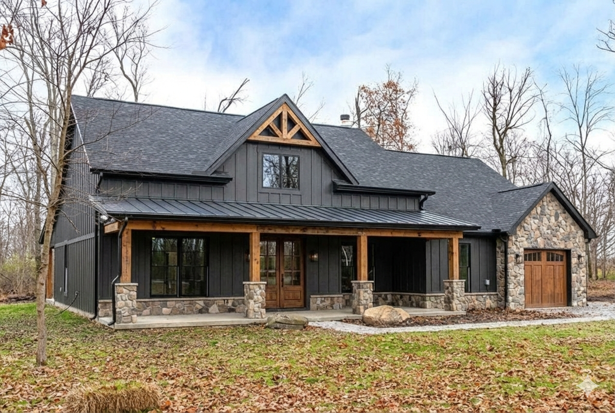
- “Iron Ore” (Sherwin-Williams): A deep, rich charcoal that isn’t quite black. It’s perfect for the Modern Farmhouse or Contemporary look, especially when paired with natural cedar accents.
- “Alabaster” (Sherwin-Williams): The gold standard for white exteriors. It’s creamy enough to avoid looking stark or “clinical” in bright sunlight but still reads as a crisp, clean white.
- “Chatroom” (Sherwin-Williams): A sophisticated greige (gray-beige) with subtle green undertones. This connects the home to the landscape and works beautifully on Craftsman or Bungalow styles.
The Debate: Light vs. Dark
When finalizing your specs, consider the practical side of your color choice, not just the aesthetic.
The Case for Light Colors (Whites, Creams, Pale Grays):
- Efficiency: Light colors reflect sunlight, keeping the home cooler in hot climates.
- Illusion: They make smaller homes appear larger and more commanding on the lot.
- Maintenance: Believe it or not, light colors often hide dust and pollen better than dark ones, and they resist fading for longer.
The Case for Dark Colors (Navys, Forest Greens, Charcoals):
- Drama: Nothing beats a dark exterior for a modern, high-end “architectural” feel.
- Contrast: Dark siding makes windows and landscaping pop.
- Warning: Dark colors absorb heat (increasing cooling bills) and tend to fade faster, potentially requiring a fresh coat sooner than lighter options.
What Makes a Home Look “Expensive”?
You don’t need a massive budget to achieve a luxury look; you just need the right palette.
- High-Contrast Trim: Pairing a dark body (like Navy) with crisp white trim creates a sharp, tailored look.
- Tone-on-Tone: For a more subtle, organic feel, use a trim color that is just one or two shades lighter/darker than the main body color. This “monochromatic” look is trending heavily in luxury markets.
- Natural Materials: Paint isn’t everything. Incorporating stone, brick, or stained wood alongside your paint color elevates the perceived value of the home instantly.
Dwelcore Pro-Tip: Check Your Code
Before you fall in love with “Iron Ore” or “Midnight Blue,” check your HOA guidelines or local zoning codes. Many developments have strict “approved color palettes” to ensure neighborhood cohesion. Verifying this before you order materials is just another way Dwelcore helps you build smarter.